react-native wrapper for android BottomSheetBehavior, supports FloatingActionButton.

See the Google Maps gif implementation
This major release v1.0.0 supports anchor state, which means that you can have a middle state between collapsed and expanded.
This version now uses a custom BottomSheetBehavior implementation from
miguelhincapie/CustomBottomSheetBehavior
which is basically a fork from the original design-support, but with anchor state support and colors management,
even though is custom implementation, old version should work as before, and you can also disable the
anchor state with anchorEnabled prop which is disabled by default.
The following components are included in this package:
NOTE We expose some android core components such as CoordinatorLayout, AppBarLayout, FloatingActionButton,
but they are NOT meant to be general purposed, and it may not work out of the context of this library,
so use at your own risk.
If you are wondering some iOS alternative, i highly recommend react-native-interactable by wix, you can see their google maps approach here, which is very easy to get started.
$ npm install react-native-bottom-sheet-behavior
$ react-native link react-native-bottom-sheet-behavior
Edit the current files as follows.
android/settings.gradle
include ':app'

+   include ':react-native-bottom-sheet-behavior'
+   project(':react-native-bottom-sheet-behavior').projectDir = new File(rootProject.projectDir, '../node_modules/react-native-bottom-sheet-behavior/android')
android/app/build.gradle
    dependencies {
        implementation fileTree(dir: "libs", include: ["*.jar"])
        implementation "com.android.support:appcompat-v7:${rootProject.ext.supportLibVersion}"
+       implementation "com.android.support:design:${rootProject.ext.supportLibVersion}"
        implementation "com.facebook.react:react-native:+"  // From node_modules
+       implementation project(':react-native-bottom-sheet-behavior')
    }
MainApplication.java
+   import com.bottomsheetbehavior.BottomSheetBehaviorPackage;

    public class MainApplication extends Application implements ReactApplication {

      @Override
      protected List<ReactPackage> getPackages() {
        return Arrays.<ReactPackage>asList(
            new MainReactPackage(),
+           new BottomSheetBehaviorPackage()
        );
      }
    }
You will need to wrap your view into a CoordinatorLayout to make it work.
    render() {
      return (
          <CoordinatorLayout style={{flex: 1}}>
            <View style={{ flex: 1, backgroundColor: 'transparent' }}></View>
            <BottomSheetBehavior
              ref='bottomSheet'
              peekHeight={70}
              hideable={false}
              state={BottomSheetBehavior.STATE_COLLAPSED}>
              <View style={{backgroundColor: '#4389f2'}}>
                <View style={{padding: 26}}>
                  <Text>BottomSheetBehavior!</Text>
                </View>
                <View style={{height: 200, backgroundColor: '#fff'}} />
              </View>
            </BottomSheetBehavior>
            <FloatingActionButton autoAnchor ref="fab" />
          </CoordinatorLayout>
      )
    }
NOTE Make sure that your view has a
backgroundColorstyle to prevent some "bugs" when rendering the container.
You should follow this component order.
render() {
  return (
    <CoordinatorLayout>
      <ScrollingAppBarLayout>
        <ToolbarAndroid />
      </ScrollingAppBarLayout>
      <View>Main Content</View>
      <BackdropBottomSheet />
      <BottomSheetBehavior />
      <MergedAppBarLayout
        <ToolbarAndroid />
      </MergedAppBarLayout>
      <FloatingActionButton />
    </CoordinatorLayout>
  )
}
In order to get the current bottom sheet state or offset, you can listen to onStateChange or onSlide respectively.
  <BottomSheetBehavior
    onSlide={(e) => console.log(e.nativeEvent.offset)}
    onStateChange={(e) => console.log(e.nativeEvent.state)}
/>We provide some custom AppBars that has custom behaviors, they automatically connects with BottomSheetBehavior
in order to connects with ToolbarAndroid and toggle visibility, both AppBars can also manager StatusBar backgrounds.
Currently, AppBars only supports ToolbarAndroid as a child, you may have some troubles trying to render a custom View.
This behavior hides and sets the StatusBar background to transparent when you starting dragging the BottomSheet,
and reappears when the BottomSheet backs to the collapsed state, setting back the StatusBar background color
with statusBarColor prop.

The MergedAppBarLayout behavior appears when the BottomSheet reaches the anchor state (or expanded state if you're not using anchorEnabled).
When the BottomSheet is getting over the MergedAppBar, it will partially sets the height of ToolbarAndroid revealing the
mergedColor prop, and when the BottomSheet is fully expanded, it sets the ToolbarAndroid with the toolbarColor prop.
<MergedAppBarLayout
  translucent={true}
  barStyle='light-content'
  barStyleTransparent='dark-content'
  mergedColor='#1abc9c'
  toolbarColor='#34495e'
  statusBarColor='#2c3e50'>
  <ToolbarAndroid
    navIconName="md-arrow-back"
    overflowIconName='md-more'
    title='React Native Bar!'
    titleColor='#fff'
  />
</MergedAppBarLayout>

Both AppBars supports translucent status bar, you can enable with translucent prop, which will basically adds top margins and NOT change the translucent itself, you should handle the translucent directely on the react-native StatusBar component.
If you are using FloatingActionButton, the autoAnchor prop will automatically connect to BottomSheetBehavior,
in order to follow when it's dragging.
<FloatingActionButton autoAnchor />You still can do it manually though, by doing this.
  componentDidMount() {
    this.refs.fab.setAnchorId(this.refs.bottomSheet)
  }
FloatingActionButton's has a custom behavior that hides when closely reaches MergedAppBarLayout.
You can also use react-native-vector-icons on FloatingActionButton, which will automatically load the icon for you.
  import Icon from 'react-native-vector-icons/Ionicons'

  ...

  render() {
    return (
      <FloatingActionButton icon={"directions"} iconProvider={Icon} />
    )
  }
You can check GoogleMapsView.js example.
This component is rendered behind the BottomSheetBehavior, and behave like a parallax when BottomSheet is dragging.
you should pass a fixed height prop that may match with anchorPoint prop from BottomSheet, in order to achieve a full screen view
when reaches the anchor state.
This component abstracts color management between BottomSheet states on the native side,
it will find all
If you are not using the anchor point, and want to add some nested scroll, you will need to install the react-native-nested-scroll-view to allows you to scroll inside bottom sheet continuously.
Note the react-native-nested-scroll-view is only useful when you are NOT using the anchorPoint.
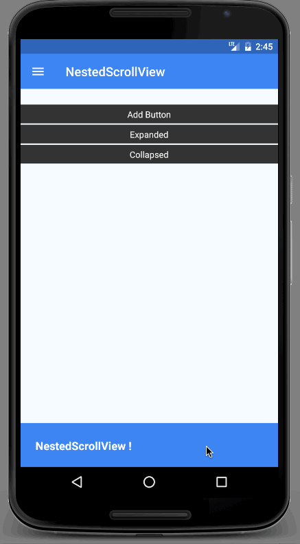
NestedScrollView.js example
BottomSheetBehavior properties
| Prop | Description | Default Value |
|---|---|---|
| state | The state of the bottom sheet | 4 (STATE_COLLAPSED) |
| peekHeight | Peek Height value in DP | 50 |
| hideable | Allow hide the bottom sheet | false |
| anchorEnabled | Enabled anchor point | false |
| anchorPoint | Anchor point where the bottom sheet should stay between collapsed and expanded | 300 |
| elevation | Elevation shadow | 0 |
| onStateChange | Callback when bottom sheet state changed | |
| onSlide | Callback continuously called while the user is dragging the bottom sheet |
BottomSheetBehavior States
| State | Description |
|---|---|
| 1 | STATE_DRAGGING |
| 2 | STATE_SETTLING |
| 3 | STATE_EXPANDED |
| 4 | STATE_COLLAPSED |
| 5 | STATE_HIDDEN |
| 6 | STATE_ANCHOR_POINT |
| Method | Description |
|---|---|
| setBottomSheetState | Sets the bottom sheet state |
| Prop | Description | Default Value |
|---|---|---|
| src | Drawable file under the drawable android folder | |
| autoAnchor | Attachs the button on bottom sheet automatically | false |
| icon | react-native-vector-icons name | |
| iconProvider | Icon package provided by react-native-vector-icons | |
| iconColor | Icon color | |
| iconColorExpanded | Icon expanded color when used by BottomSheetHeader | |
| backgroundColor | Background color | |
| backgroundColorExpanded | Background expanded color used by BottomSheetHeader | |
| hidden | Hides FloatingActionButton | false |
| rippleEffect | Enable rippleEffect | true |
| rippleColor | Ripple color | |
| elevation | Elevation shadow | 18 |
| onPress | Callback called when touch is released |
| Method | Description |
|---|---|
| show | This method will animate the button show if the view has already been laid out |
| [hide](https://developer.android.com/reference/android/support/design/widget/FloatingActionButton.html#hide()) | This method will animate the button hide if the view has already been laid out |
| setAnchorId | Attachs the button on bottom sheet by passing it as a argument (no needed if autoAnchor is set true) |
| Prop | Description |
|---|---|
| height | Height of ScrollingAppBarLayout |
| statusBarColor | Active status bar color |
| translucent | Adds top margins on the AppBar to not draw behind the status bar |
| barStyle | Status Bar style, (default, light-content, dark-content), used when the ScrollingAppBarLayout is present |
| barStyleTransparent | Status Bar style, (default, light-content, dark-content), used when the ScrollingAppBarLayout is not present and the StatusBar is transparent |
| Prop | Description |
|---|---|
| height | Height of ScrollingAppBarLayout |
| mergedColor | Merged color when the bottom sheet is overlaying with ToolbarAndroid |
| toolbarColor | The final ToolbarAndroid color when the bottom sheet is fully expanded |
| statusBarColor | Active status bar color when bottom sheet is expanded |
| translucent | Adds top margins on the AppBar to not draw behind the status bar |
| barStyle | Status Bar style, (default, light-content, dark-content), used when the BottomSheet is fully expanded |
| barStyleTransparent | Status Bar style, (default, light-content, dark-content), used when the AppBar is transparent |
| Prop | Description |
|---|---|
| textColorExpanded | The state of the bottom sheet |
| backgroundColor | Background color when collased |
| backgroundColorExpanded | Background color when anchored or expanded |
| onPress | Callback called when header touch is released |