Please use the TableLayout discussion group for support.
TableLayout is a lightweight Java library for setting the position and size of UI widgets using a logical table, similar to HTML tables. The core of TableLayout is UI toolkit agnostic and comes with support for Swing, Android, and TWL. Layout using tables is intuitive and TableLayout's Java API is very easy to use.
A fork of TableLayout is included inside libgdx, so TableLayout is not needed if using libgdx.
Here is a quick example of a simple form in libgdx:
    // Keep your code clean by creating widgets separate from layout.
    Label nameLabel = new Label("Name:", skin);
    TextField nameText = new TextField(skin);
    Label addressLabel = new Label("Address:", skin);
    TextField addressText = new TextField(skin);

    Table table = new Table();
    table.add(nameLabel);              // Row 0, column 0.
    table.add(nameText).width(100);    // Row 0, column 1.
    table.row();                       // Move to next row.
    table.add(addressLabel);           // Row 1, column 0.
    table.add(addressText).width(100); // Row 1, column 1.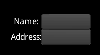
This code adds 4 cells to the table which are arranged in two columns and two rows. The add method returns a Cell, which has methods to control layout. Here the width of the text fields are set to 100.
The example code used in this documentation is for libgdx, but the API for the other supported toolkits is almost identical.
When doing UI layout, a UI widget does not set its own size. Instead, it provides a minimum, preferred, and maximum size. The widget's parent uses its own size along with these hints to size the widget. Many layouts will use a single table at the root which has a fixed size, often the whole screen. Widgets and nested tables are added to the root table.
Sizing the root table varies in each UI toolkit. Eg, in Swing you would likely add the table to the JFrame's content pane. In libgdx the setFillParent method can be used:
    Table table = new Table();
    table.setFillParent(true);
stage.addActor(table);TableLayout can draw debug lines to visualize what is happening in the layout. Debugging is enabled by calling debug on the table. libgdx automatically renders debug lines if they are enabled. Other UI toolkits may require a method to be called to render the lines.
    table.debug();      // Turn on all debug lines (table, cell, and widget).
table.debugTable(); // Turn on only table lines.Widgets are added to a table with the add method (for UI toolkits that already have an add method, addCell is used). This adds a cell to the current row. To move to the next row, call the row method.
    table.add(nameLabel);    // Row 0, column 0.
    table.add(nameText);     // Row 0, column 1.
    table.row();             // Move to next row.
    table.add(addressLabel); // Row 1, column 0.
    table.add(addressText);  // Row 1, column 1.
The add method returns a Cell, which has properties that control the layout. Every method on the cell returns the cell, allowing calls to be chained.
table.add(nameText).padLeft(10).width(100); // Sets left padding and width on the new cell.The cells make up a logical table, but it is not sized to the table widget.
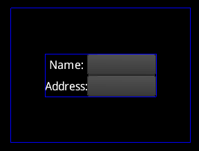
The outer blue rectangle shows the size of the table widget. The inner blue rectangle shows the size of the logical table, which is aligned to center by default. The alignment can be changed using methods on the table. The table methods return the table, so can be chained just like the cell methods.
table.right().bottom();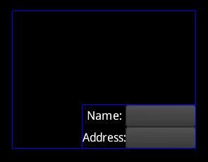
To make the logical table take up the entire size of the table widget, TableLayout needs to be told which cells will receive the extra space.
    table.add(nameLabel).expandX(); // Column 0 receives all extra horizontal space.
    table.add(nameText).width(100);
    table.row();
    table.add(addressLabel);
    table.add(addressText).width(100);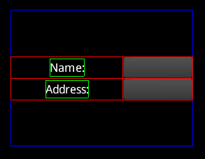
The red lines show the cell bounds and the green lines show the widget bounds. Note that the left column has received all of the extra space in the x direction. Only one cell needs to have expand to cause the entire column or row to expand. If multiple columns expand, the extra space is distributed evenly.
    table.add(nameLabel).expandX();           // Receives extra horizontal space.
    table.add(nameText).width(100).expandX(); // Also receives extra horizontal space.
    table.row();
    table.add(addressLabel);
    table.add(addressText).width(100);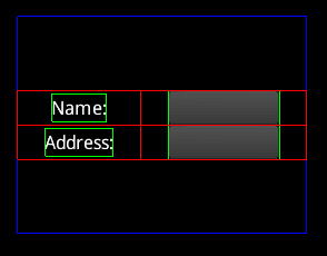
Expand also works in the y direction via the expandY method. The expand method causes expand to happen in both directions.
    table.add(nameLabel).expand();     // Receives all extra horizontal and vertical space.
    table.add(nameText).width(100);
    table.row();
    table.add(addressLabel);
    table.add(addressText).width(100);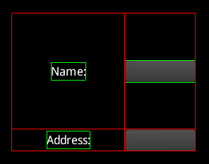
Similar to aligning the logical table, a widget can be aligned inside the cell.
    table.add(nameLabel).expand().bottom().right(); // Aligned bottom right.
    table.add(nameText).width(100).top();           // Aligned top.
    table.row();
    table.add(addressLabel);
    table.add(addressText).width(100);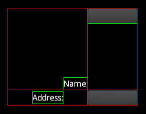
The fill method causes a widget to be sized to the cell. Like expand, there are also fillX and fillY methods.
    table.add(nameLabel).expand().bottom().fillX(); // Sized to cell horizontally.
    table.add(nameText).width(100).top();
    table.row();
    table.add(addressLabel);
    table.add(addressText).width(100);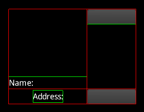
Note the red cell lines are drawn on top of the green widget lines.
By default, the table attempts to size widgets to their preferred size. If the widgets don't fit, they are sized between their preferred size and their minimum size, with widgets that have a larger preferred size receiving more space. If the widgets don't fit at their minimum size then the layout is broken and widgets may overlap. The fill methods won't make a widget larger than the widget's maximum size.
Widgets should not be subclassed to change the preferred, minimum, or maximum size. Instead, these sizes can be set on the cell and will be used instead of the widget's value.
    table.add(nameLabel);
    table.add(nameText).minWidth(100);     // Sets min width.
    table.row();
    table.add(addressLabel);
    table.add(addressText).prefWidth(999); // Sets pref width.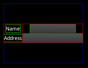
Here the prefWidth of 999 is larger than the table, so it is sized down to fit.
width is a shortcut method for setting minWidth, prefWidth, and maxWidth to the same value. height is a shortcut method for setting minHeight, prefHeight, and maxHeight to the same value. The size method takes a width and a height and sets all six properties.
Padding is extra space around the edges of a cell.
    table.add(nameLabel);
    table.add(nameText).width(100).padBottom(10); // Sets bottom padding.
    table.row();
    table.add(addressLabel);
    table.add(addressText).width(100).pad(10);    // Sets top, left, bottom, right padding.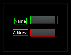
Note that padding between cells combines, so there are 20 pixels between the text fields. The debug lines don't necessarily show which cell the padding comes from, since it is not important for the layout of the table.
Padding can also be applied to the edges of the table.
table.pad(10);Like padding, spacing is extra space around the edges of a cell. However, spacing between cells does not combine, instead the larger of the two is used. Also, spacing is not applied at the edge of the table. Spacing makes it easy to have consistent space between cells.
    table.add(nameLabel);
    table.add(nameText).width(100).spaceBottom(10); // Sets bottom spacing.
    table.row();
    table.add(addressLabel);
    table.add(addressText).width(100).space(10);    // Sets top, left, bottom, right spacing.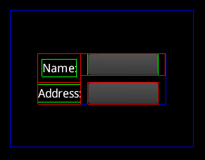
Note that the spacing between cells doesn't combine, so there are 10 pixels between the text fields. Also note that there is no spacing under the bottom text field because spacing isn't applied around the edge of the table.
A cell can span multiple columns.
    table.add(nameLabel);
    table.add(nameText).width(100).spaceBottom(10);
    table.row();
    table.add(addressLabel).colspan(2);             // Spans 2 columns.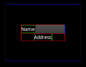
Note that there is no rowspan. To acheive this, use a nested table.
Cells with uniform set to true will be the same size.
    table.add(nameLabel).uniform();           // These two cells will have
    table.add(nameText).width(100).uniform(); // the same width and height.
    table.row();
    table.add(addressLabel);
    table.add(addressText).width(100);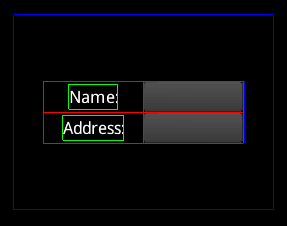
Often many cells have the same properties, so setting the default properties for all cells can greatly reduce the code needed for a layout. The defaults method on the table returns a cell whose properties are the defaults for all cells.
    table.defaults().width(100); // Sets defaults for all cells.
    table.add(nameLabel);
    table.add(nameText);
    table.row();
    table.add(addressLabel);
    table.add(addressText);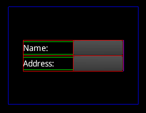
The columnDefaults method on the table returns a cell whose properties are the defaults for all cells in that column. Any properties set here will override the cell default properties. Columns are indexed starting at 0.
    table.columnDefaults(1).width(150); // Sets defaults for cells in column 0.
    table.add(nameLabel);
    table.add(nameText);
    table.row();
    table.add(addressLabel);
    table.add(addressText);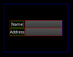
When the row method is called, it returns a cell whose properties are the defaults for all cells in that row. Any properties set here will override both the cell default properties and the column default properties. Note it is allowed to call row before any cells are added. This allows the first row to have row default properties.
    table.row().height(50);  // Set cell defaults for row 0.
    table.add(nameLabel);
    table.add(nameText);
    table.row().height(100); // Set cell defaults for row 1.
    table.add(addressLabel);
    table.add(addressText);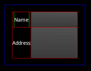
A stack widget is a special kind of container that lays out each child to be the size of the stack. This is useful when it is necessary to have widgets stacked on top of each other. The first widget added to the stack is drawn on the bottom, and the last widget added is drawn on the top.
On Android, when the application starts, AndroidToolkit.setup must be called:
AndroidToolkit.setup(yourActivity, R.drawable.class);A few Java, table-based layout managers:
GridBagLayout can handle complex table-based layouts, but does so via a clunky API.
TableLayout (the other one) uses 2D arrays of percentages, sizes, and flags to describe the table and how it should be sized. This approach has the same problems as GridBagLayout.
PageLayout uses a concise Java API to describe the table.
PnutsLayout (webpage no longer available) was written by Toyokazu Tomatsu as part of Pnuts. TableLayout was originally inspired by PnutsLayout.
UIHierarchy was also inspired by PnutsLayout. It is interesting because it is not actually a layout manager, instead it uses a combination of method chaining and constraint strings to more cleanly create UI hierarchies and configure layout parameters.
RiverLayout uses tags in constraint strings.
FormLayout is similar to RiverLayout, but more sophisticated.
MIGLayout is even more sophisticated than FormLayout. It attempts to support many kinds of layouts beyond tables and has a somewhat bloated number of features. It has a complex constraint language. It can layout using a grid, border, absolute, etc.
DesignGridLayout uses canonical grids. For the most part, widgets are simply added and the ideal table is determined automatically. This cuts down the needed Java code to a minimum and enforces UI guidelines. The downside is that DesignGridLayout does not handle arbitrary table layouts. If a UI problem can be handled using a canonical grid, DesignGridLayout is the most elegant solution. If you want to deviate from a canonical grid, you have no recourse.
Please feel free to submit additional libraries to be included in this section or suggest better descriptions.